Color drenching is everywhere right now. From design magazines and renovation shows to social media feeds, this bold decorating trend has become hard to miss. And once you notice it, you start seeing it everywhere.
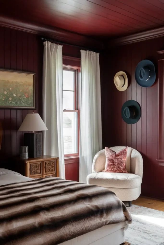
The technique involves enveloping an entire room in a single color—painting the walls, trim, doors, and sometimes even the ceiling in the same shade. Unlike a traditional accent wall, color drenching creates a fully immersive look that can completely transform the mood of a space.
At first, I thought the idea might feel too bold or even a little overwhelming for everyday living. But after seeing beautifully executed spaces and experimenting with the technique in my own guest bathroom, I changed my mind. There is something unexpectedly calming about being surrounded by one cohesive color. With fewer contrasting elements competing for attention, the room feels more unified, intentional, and restful.
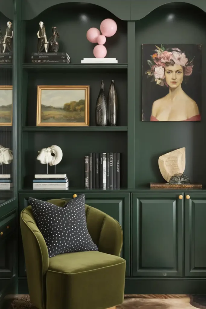
color-drenching-for-the-love-of-living-1
What Is Color Drenching—and Why Is It Trending?
Color drenching is the practice of using one color across nearly every surface in a room. Instead of painting walls one shade and keeping trim, doors, and moldings white or contrasting, the same hue is carried throughout the space for a seamless, enveloping effect.
Designers love the technique because it allows architectural details to stand out through light, shadow, and texture rather than sharp color contrast. When everything is painted in the same shade, the eye becomes more aware of subtle details such as crown molding, arches, paneling, and recessed areas.
Color drenching can also work beautifully in small rooms. Rather than drawing attention to the room’s boundaries, the continuous color creates a sense of cohesion that makes the space feel intentional and thoughtfully designed.
Its popularity may also reflect a move away from the stark, all-white interiors that dominated the previous decade. As homeowners look for spaces with more personality, warmth, and emotional impact, color drenching offers a dramatic yet surprisingly simple way to create character without relying on excessive décor or complicated design schemes.
How to Choose the Right Color
Choosing a color for a drenched space requires a little more thought than selecting a standard wall paint. Because the color covers so many surfaces, it will respond differently to changing light throughout the day. A dusty blue that looks soft and calming in the morning may appear much grayer—or even slightly purple—by evening.
Before committing, test your chosen shade on several surfaces and observe it at different times of day.
For a first color-drenching project, gentle mid-tones are often the easiest to live with. They create impact without feeling overly intense.
Rich Options
- Deep teal with gray undertones
- Burgundy with warm brown notes
- Olive green with a touch of gold
- Slate blue with subtle warmth
Softer Options
- Blush pink with taupe undertones
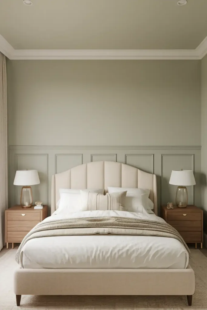
- Misty sage green
- Powder blue with a hint of gray
- Warm greige
The direction your room faces also makes a major difference. North-facing rooms tend to receive cooler, more diffused light, which can make colors appear muted or slightly colder. Warmer shades can help balance that effect. South-facing rooms receive stronger, warmer sunlight and often work beautifully with cooler hues such as blues and greens.
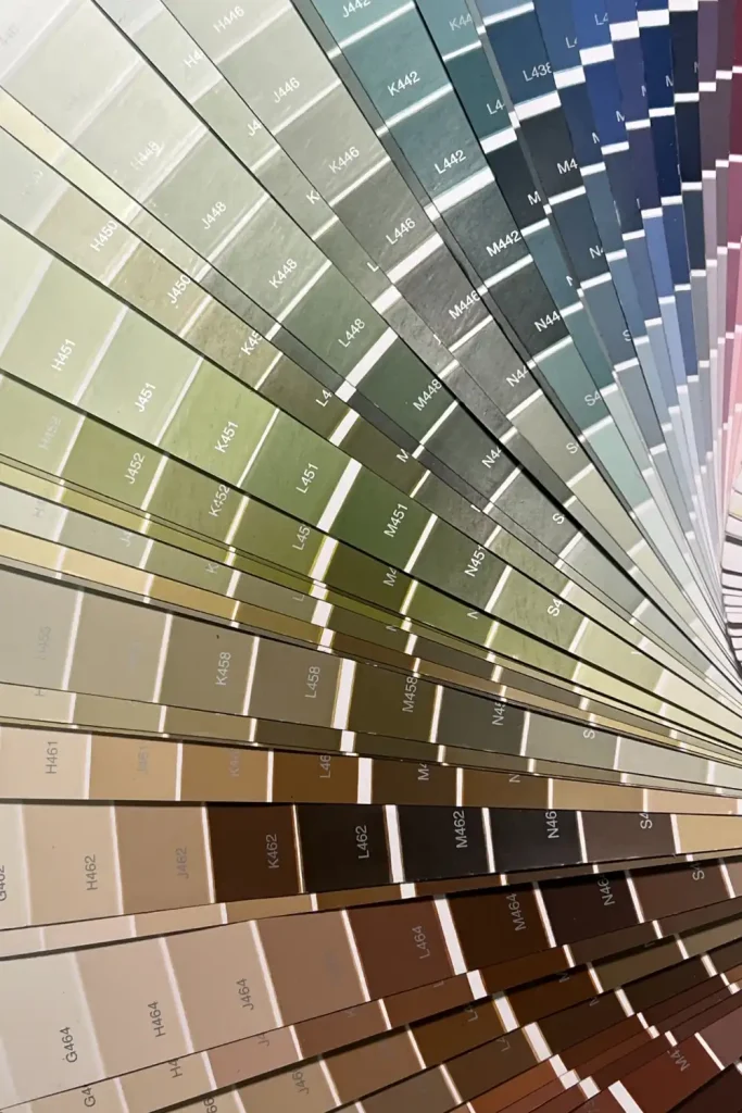
Color drenching palette samples showing different color options for various room orientations
Designer Tips for Getting It Right
The paint finish you choose can be just as important as the color itself. Using a high-gloss finish across large wall surfaces can sometimes create an overly shiny or plastic-looking effect. A more balanced approach usually produces a richer, more sophisticated result.
Best Practices
- Choose flat or eggshell paint for walls to create depth
- Use satin on trim and woodwork for subtle contrast
- Consider a lighter variation of the same color for the ceiling
- Test paint samples on every surface before committing
- Use layered lighting to highlight architectural details
Common Mistakes to Avoid
- Using high-gloss paint on every surface
- Ignoring how the color changes in evening light
- Skipping proper surface preparation
- Choosing a trend-driven shade you may quickly tire of
- Overlooking the undertones in existing furniture and finishes
One of the easiest ways to add dimension is to use the same color in different finishes. Matte walls paired with satin trim, for example, create subtle variation while maintaining the cohesive effect of color drenching. Because each finish reflects light differently, the room gains texture and depth without introducing another color.
The ceiling also deserves careful consideration. Using the same color overhead can create a beautifully cocooning effect, especially in powder rooms, reading nooks, and other intimate spaces. If you are concerned about the ceiling feeling too heavy, try using a slightly lighter version of the wall color instead.
Color-Drenching Alternatives for a Softer Look
If painting an entire room in one color feels like too much of a commitment, there are several ways to experiment with the trend on a smaller scale.
Color Blocking
Paint the lower two-thirds of the walls, along with the trim and doors, in your chosen color while keeping the upper walls and ceiling neutral. This creates a grounded, cohesive look while maintaining a sense of lightness.
Feature Drenching
Apply the technique to a specific architectural feature, such as built-in shelving, a window nook, or a recessed wall. This creates a focused color moment without overwhelming the entire room.
Coordinated Elements
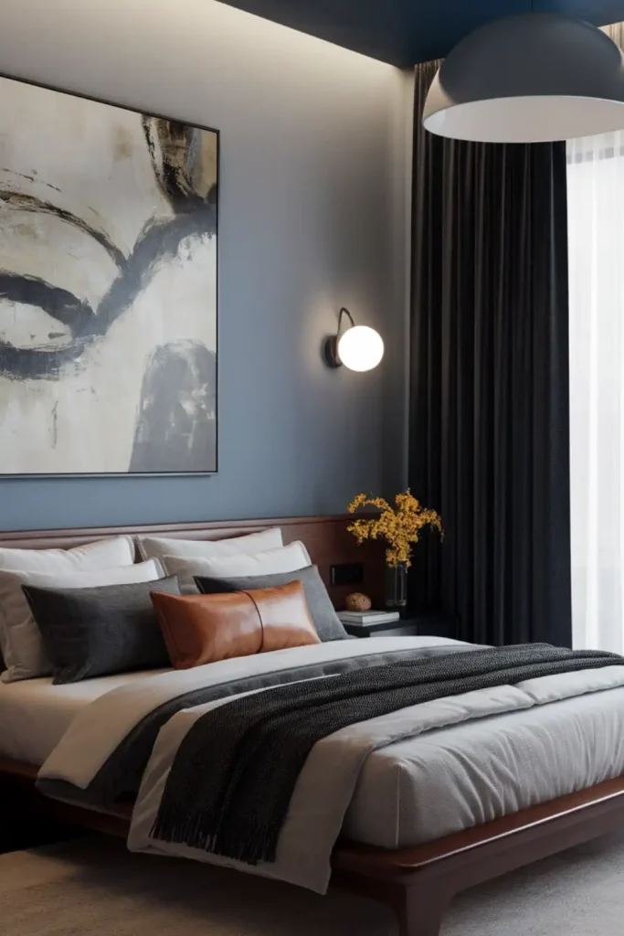
Paint one wall in your chosen shade, then repeat that color on furniture, door frames, shelving, or window treatments. The result feels cohesive and intentional while offering a more restrained take on the trend.
These approaches can be especially useful in open-concept homes, where fully color-drenching a large space may feel overwhelming or difficult to coordinate with adjoining rooms.
color-drenching-for-the-love-of-living-4
DIY vs. Hiring a Professional
Color drenching may seem like a straightforward painting project, but getting a polished result requires patience and attention to detail. Although everything is the same color, walls, trim, doors, and ceilings may require different paint formulations and finishes. Careful preparation and clean application are still essential.
If you are trying the technique yourself, start with a smaller space such as a powder room, home office, or reading nook.
Useful supplies include:
- Quality synthetic brushes for cutting in around details
- Medium-nap rollers for walls
- Foam or short-nap rollers for trim
- Surface-specific primers
- Plenty of painter’s tape for clean transitions
Hiring a professional may be worth considering if your room has intricate molding, high ceilings, or detailed trim work. It can also be helpful when working with dark or highly saturated colors, which tend to reveal imperfections more easily. Professional painters may also use spraying equipment to achieve a smoother finish on detailed surfaces.
How to Style a Color-Drenched Room
Once the painting is complete, furnishings and accessories become especially important. When the walls, trim, and ceiling are all wrapped in one dominant color, the furniture should provide balance without competing with the space.
Neutral-toned furniture is often a safe choice because it gives the eye a place to rest. Texture, meanwhile, becomes one of the most effective ways to create depth and interest.
In a color-drenched space, texture can do much of the decorative work. Layer materials such as linen, velvet, leather, natural wood, woven fibers, and reflective metals to add dimension without disrupting the room’s cohesive palette.
Natural Materials
- Blonde or walnut wood
- Natural-fiber baskets
- Marble or travertine
- Plenty of greenery
Fabric Choices
- Textured cotton and linen
- Chunky knit throws
- Velvet in complementary tones
- Vintage textiles with subtle patterns
Finishing Touches
- Unlacquered brass fixtures
- Handblown glass
- Matte ceramics in tonal variations
- Black-and-white photography
Lighting is also essential. Use multiple light sources at different heights—such as table lamps, floor lamps, sconces, and overhead fixtures—to create layers of illumination. This helps reveal the subtle ways your chosen color shifts throughout the room and prevents the space from feeling flat.
color-drenching-for-the-love-of-living-4
Color drenching may be a bold trend, but it does not have to feel overwhelming. The key is choosing a color you genuinely enjoy, paying attention to light and finish, and adding plenty of texture to balance the look. Whether you fully drench a room or start with a smaller feature, this technique can create a space that feels warm, immersive, and distinctly personal.
Try beginning with one small room to see how the technique works in your home before committing to a larger space.