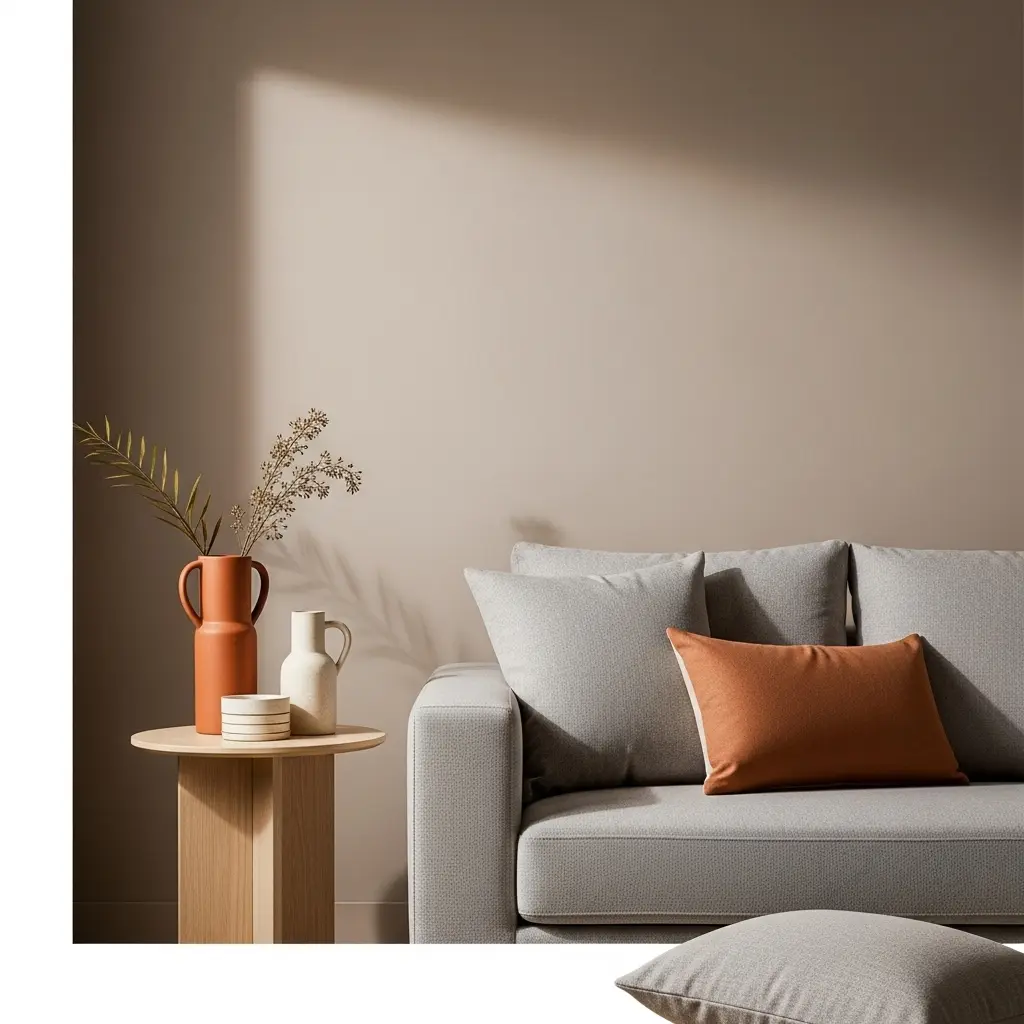
Ever stepped into a room and immediately felt relaxed, refreshed, energized, or even slightly uneasy without knowing exactly why? That reaction may have more to do with color psychology than you realize. The colors surrounding us can influence how a space feels and can shape the overall atmosphere of our homes.

Choosing a paint color is often based on personal taste, current trends, Pinterest inspiration, or a shade that looked perfect in someone else’s home. But the same color can feel completely different depending on the room, lighting, furniture, and surrounding tones.
Understanding color psychology in interiors can make decorating decisions much easier. Instead of choosing colors simply because they look attractive, you can create a palette that supports the mood and purpose of each room.
In this detailed guide, we’ll explore:
- ✨ How different colors can influence mood and atmosphere
- ✨ What popular colors communicate in interior design
- ✨ How to create the right palette for each room in your home
- ✨ Common color mistakes that can make a space feel overwhelming
- ✨ Practical styling ideas to help you use color with confidence
- ✨ Simple ways to balance bold, neutral, warm, and cool shades
Whether you’re refreshing a single room or planning a complete home makeover, learning how color works can help you create interiors that look beautiful and feel right.
Why Color Psychology Matters in Interior Design
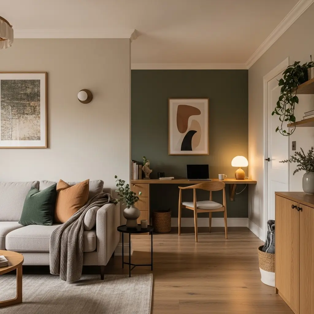
Color psychology matters in interior design because colors can influence how a room feels and how people experience the space. The right shades can make a room feel calm, welcoming, energetic, focused, or cozy, while the wrong combination may create a space that feels uncomfortable or overwhelming. By understanding how different colors affect mood, you can create rooms that look beautiful while also supporting your lifestyle and emotional needs.
Color can help you:
- Create a specific mood for each room
- Improve visual flow and harmony
- Express your personal style
- Support a sense of comfort and well-being
- Make your home feel thoughtfully designed
When your color palette matches the purpose of a room, your home can become more than just attractive—it can feel genuinely comfortable and personal.
The Basics – Understanding the Color Wheel Like a Pro
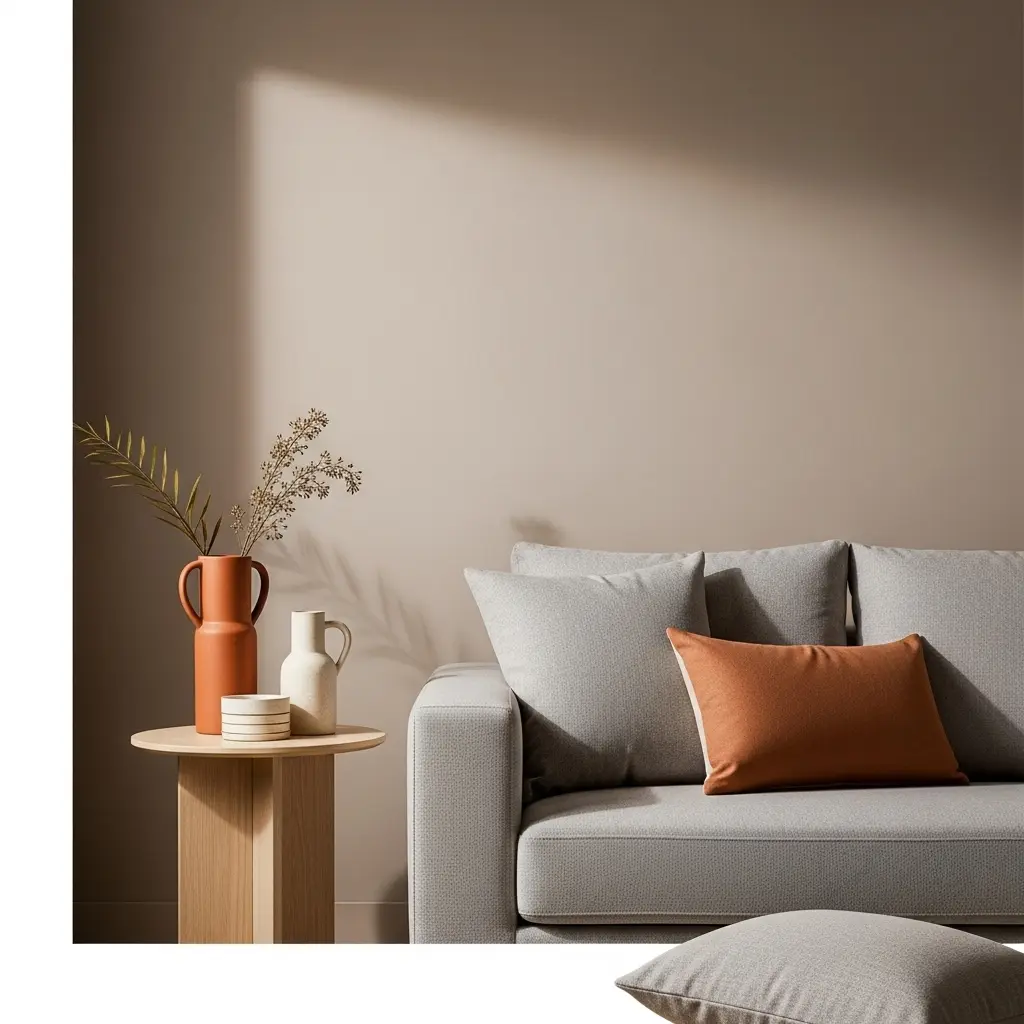
Understanding the basic color categories makes it easier to create a balanced interior palette. Colors can generally be grouped into warm tones, cool tones, and neutrals, with each category creating a different visual and emotional effect. Knowing how these groups work together gives you a strong foundation before you start selecting paint, furniture, accessories, or decorative accents.
Warm Colors
Warm colors include reds, oranges, and yellows. These shades can create a sense of energy, warmth, enthusiasm, and movement, making them especially useful in spaces designed for conversation and activity.
Cool Colors
Cool colors include blues, greens, and purples. They generally create a peaceful and soothing atmosphere, making them suitable for spaces where relaxation, focus, and calm are important.
Neutrals
Neutrals include whites, creams, taupes, beiges, grays, and blacks. They provide a versatile foundation that can work with almost any decorating style. Neutral shades are particularly useful for creating a clean, sophisticated, and cohesive interior.
Color Psychology Explained — What Every Color Means in Home Decor
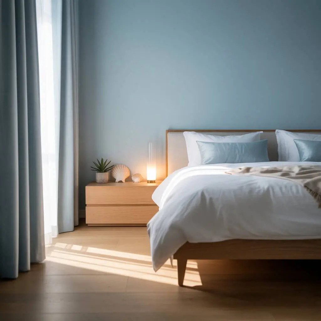
Every color can create a different emotional impression, which makes color selection an important part of home decorating. From peaceful blues to energetic oranges and sophisticated blacks, understanding the character of each shade can help you choose colors that suit both the room and the mood you want to create.
Blue — The Calming Classic
Blue is associated with calmness, peace, and stability. Its soothing character makes it a popular choice for rooms where you want to relax, concentrate, or unwind.
Blue evokes:
- Peace
- Serenity
- Focus
Best for:
- Bedrooms
- Bathrooms
- Home offices
Styling tip: Pair soft blue shades with crisp white for a light, airy, and coastal-inspired atmosphere.
Green — The Harmonious Healer

Green brings a natural and refreshing feeling into an interior. Because it is strongly connected with nature, it can help create a balanced and comfortable atmosphere.
Green evokes:
- Renewal
- Calm
- Freshness
Best for:
- Living rooms
- Kitchens
- Bedrooms
Styling tip: Combine olive green with brass details for a warm and sophisticated look.
Yellow — Sunshine for Your Space

Yellow brings brightness and optimism into a room. It can make an interior feel cheerful, creative, and welcoming, although stronger shades are best used thoughtfully.
Yellow evokes:
- Optimism
- Warmth
- Creativity
Best for:
- Kitchens
- Dining areas
- Craft rooms
Styling tip: Use yellow selectively because too much of an intense shade can become visually overstimulating.
Red — The Bold Energizer
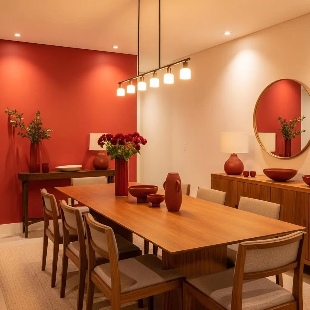
Red is a powerful color associated with energy, passion, confidence, and excitement. Because it has a strong visual presence, it works particularly well as an accent or in social areas.
Red evokes:
- Excitement
- Confidence
- Appetite
Best for:
- Dining rooms
- Accent walls
- Social spaces
Styling tip: Consider terracotta when you want the warmth of red with a softer, more earthy appearance.
Pink — The Soft Romantic

Pink ranges from delicate blush tones to deeper dusty rose shades and can bring warmth and softness into an interior. It can feel romantic and comforting without necessarily making a space look overly traditional.
Pink evokes:
- Warmth
- Romance
- Comfort
Best for:
- Bedrooms
- Nurseries
- Reading nooks
Styling tip: Combine pink with charcoal or black to create a more sophisticated and modern appearance.
Purple — The Luxurious Dreamer
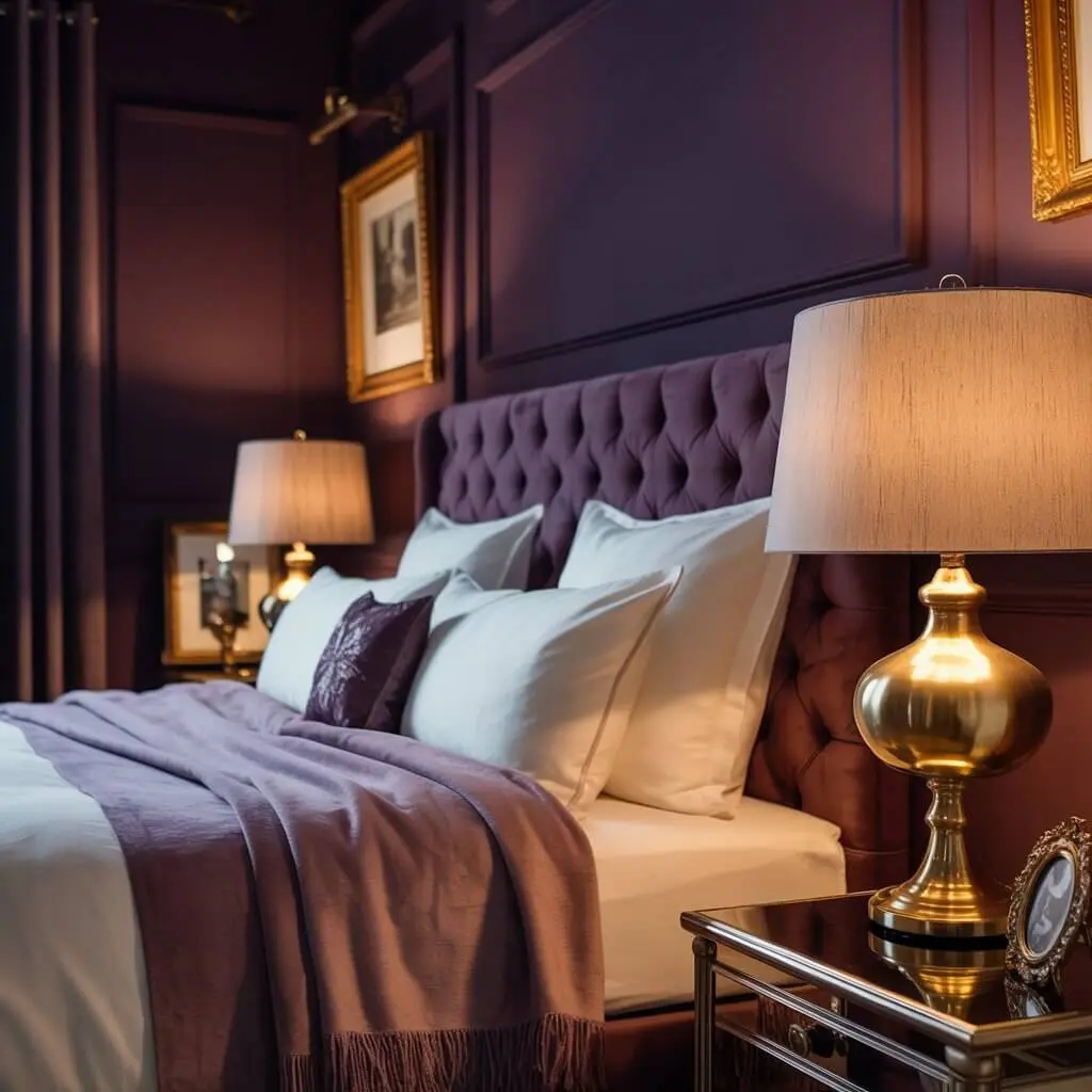
Purple has a rich and expressive character that can add creativity, luxury, and mystery to an interior. Depending on the shade, it can work as either a relaxing color or a dramatic decorative statement.
Purple evokes:
- Imagination
- Luxury
- Calm
Best for:
- Bedrooms
- Home offices
- Boudoir spaces
Orange — The Playful Motivator
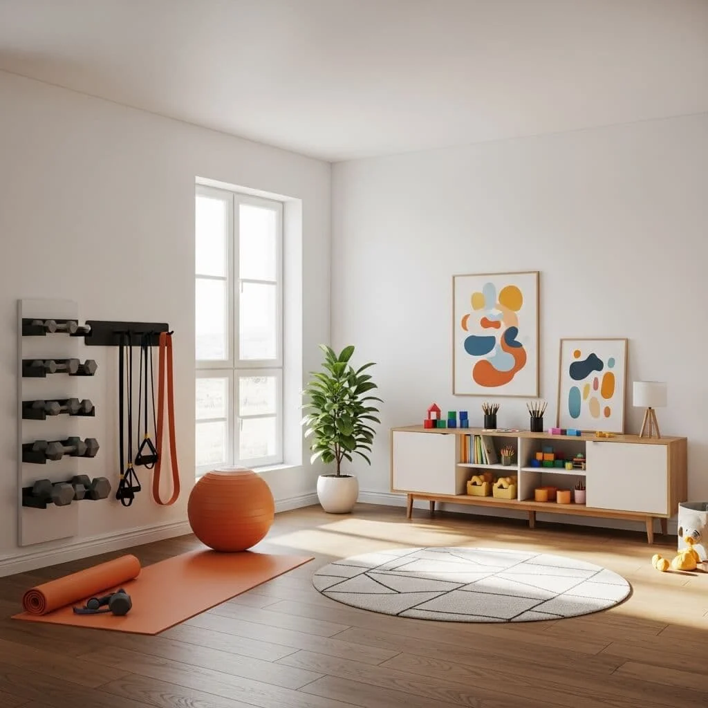
Orange is energetic, cheerful, and expressive. It can encourage a lively atmosphere, but stronger orange shades should be balanced with quieter colors to prevent the room from feeling overwhelming.
Orange evokes:
- Creativity
- Confidence
- Enthusiasm
Best for:
- Gyms
- Game rooms
- Kids’ play areas
Brown — The Cozy Stabilizer
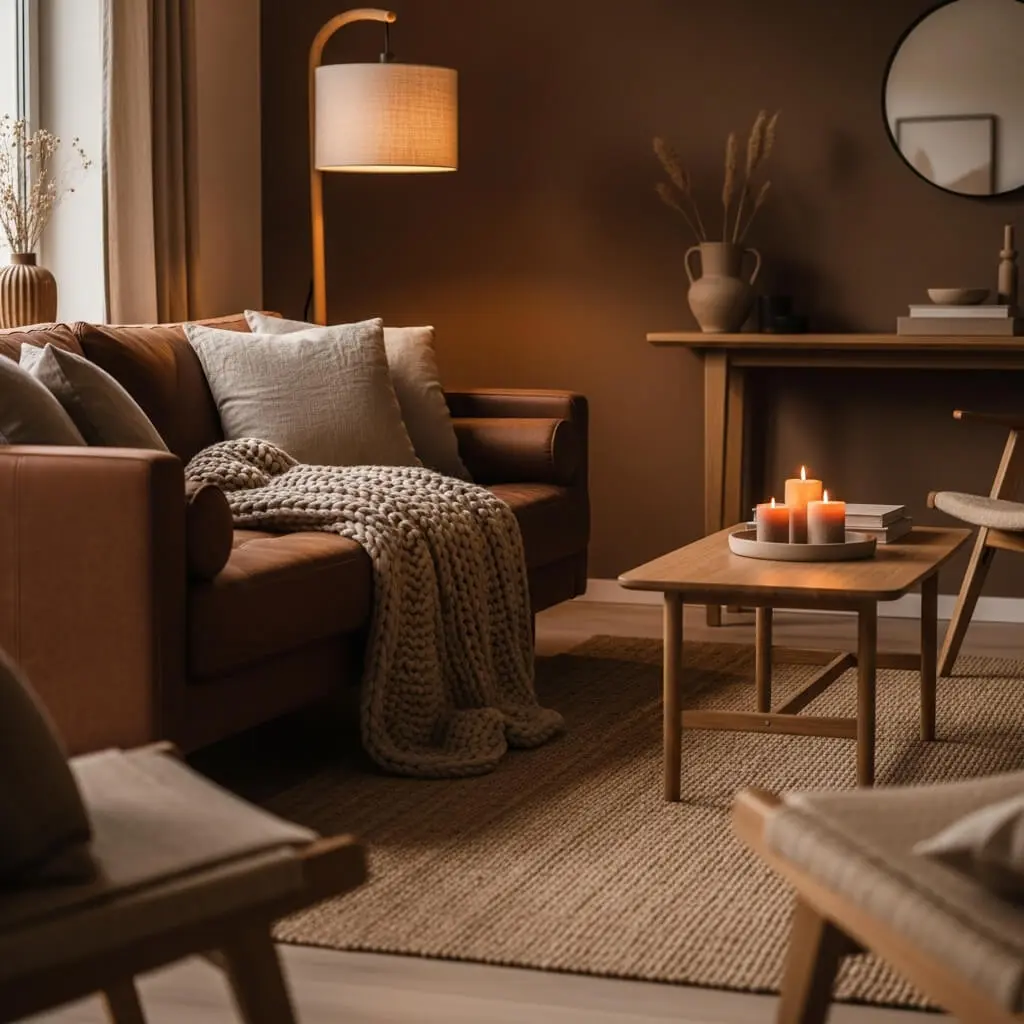
Brown creates an earthy, grounded feeling and works particularly well when you want an interior to feel warm, natural, and comfortable. Its connection with wood and other organic materials makes it easy to incorporate into cozy decorating schemes.
Brown evokes:
- Security
- Warmth
- Stability
Best for:
- Living rooms
- Bedrooms
- Entryways
Styling tip: Layer different brown shades with natural materials to create a warm, organic, and relaxed minimalist look.
Black — The Sophisticated Statement

Black adds depth, drama, elegance, and visual contrast to an interior. It can create a sophisticated appearance when used thoughtfully, especially through cabinetry, fixtures, furniture, or accent walls.
Black evokes:
- Elegance
- Depth
- Power
Best for:
- Accent walls
- Bathrooms
- Kitchens
Styling tip: Matte black finishes can add drama while creating a softer appearance than highly reflective surfaces.
White — The Clean Canvas
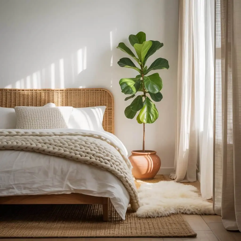
White represents simplicity, freshness, clarity, and openness. Its versatility allows it to work in almost any room, while its neutral character makes it easy to combine with different colors and textures.
White evokes:
- Freshness
- Clarity
- Openness
Best for:
- Every room
Styling tip: Add different textures, fabrics, wood elements, and decorative details to prevent an all-white room from feeling flat or overly plain.
How to Choose the Perfect Color Palette for Your Home
Choosing the perfect color palette becomes easier when you consider the purpose of each room, the available light, and the overall style of your home. Instead of selecting individual colors randomly, build your palette around a dominant shade and then introduce supporting and accent colors. This creates a more intentional and visually balanced result.
Identify the Mood of the Room
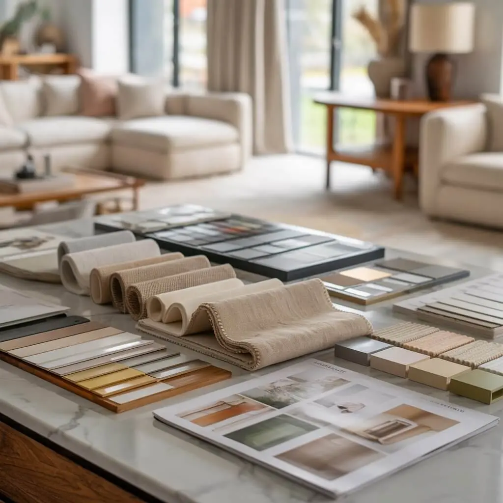
Start by deciding how you want the room to feel before choosing specific colors. Think about whether you want the space to feel calm, energetic, cozy, bright, social, or private.
Ask yourself:
- Should this space feel calming or energizing?
- Do you want it cozy or bright?
- Is it social or private?
Your desired emotional atmosphere will help determine which colors are most suitable.
Consider the Natural Lighting
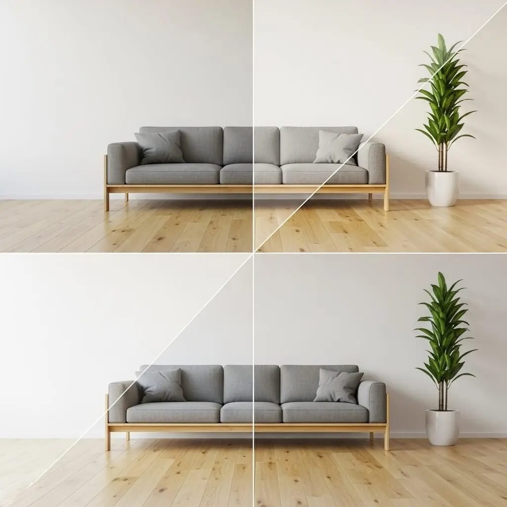
Natural light can dramatically change the way a color appears throughout the day. The direction a room faces can influence whether colors look warmer, cooler, brighter, or more muted.
- North-facing rooms → cooler, muted tones
- South-facing rooms → warm, golden tones
- East-facing rooms → bright mornings, soft evenings
- West-facing rooms → warm afternoons and deep golden sunsets
Always test paint samples in the actual room and observe them under different lighting conditions before making a final decision.
Pick a Dominant Color
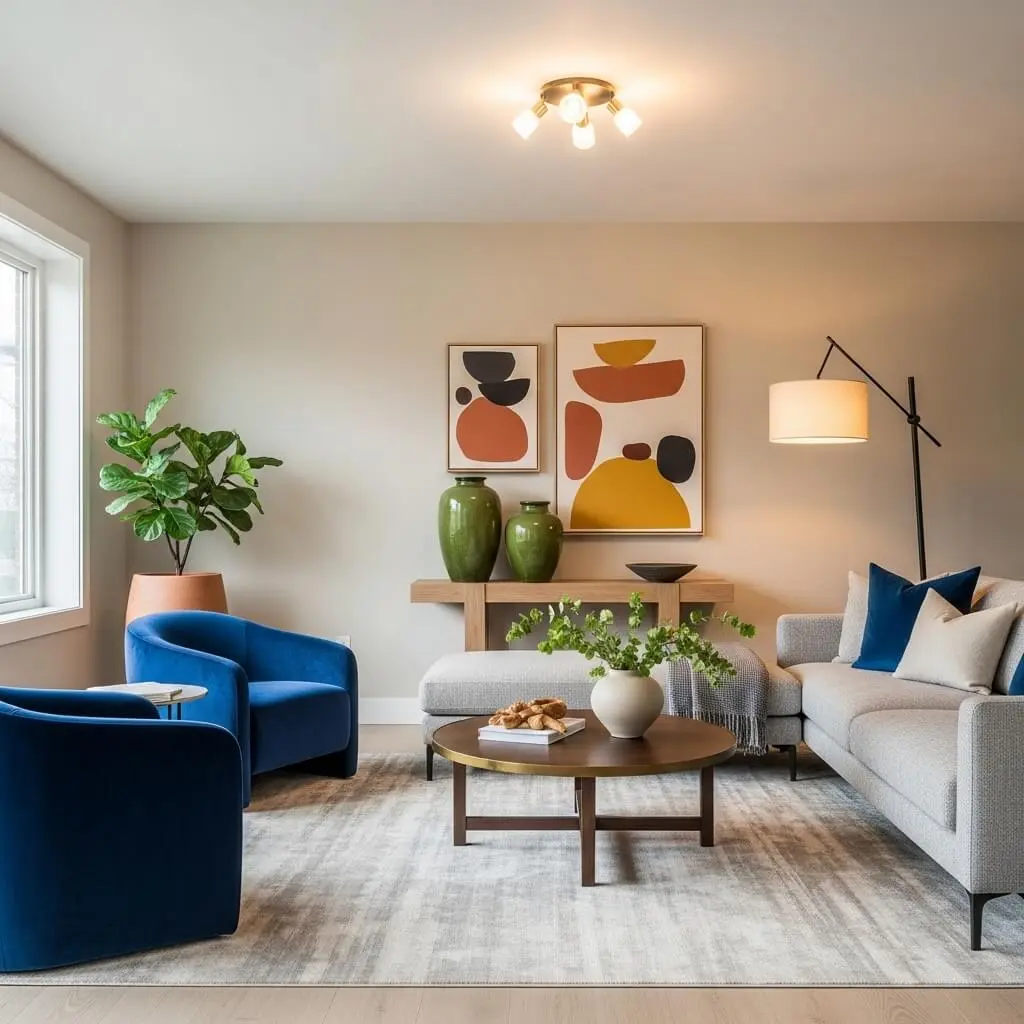
Choose one main color that will establish the overall foundation of the room. This is often a neutral or soft shade that can work comfortably with furniture, flooring, walls, and decorative elements.
Common dominant colors include:
- Warm beige
- Off-white
- Greige
- Light gray
- Muted sage
Add Your Secondary Colors
Secondary colors support the dominant shade and can be introduced through furniture, rugs, curtains, artwork, and other larger decorative elements.
Some balanced combinations include:
- White + navy + gold
- Beige + sage + wood tones
- Black + blush + cream
Add Accent Colors for Personality
Accent colors give your interior more character and allow you to introduce stronger or more expressive shades without overwhelming the entire room.
Use accent colors in:
- Pillows
- Wall art
- Decor pieces
- Lamps
- Throw blankets
Popular accent choices include:
- Mustard
- Emerald
- Burnt orange
- Terracotta
- Dusty pink
Use the 60-30-10 Rule
The 60-30-10 rule is a simple interior design formula for distributing colors throughout a room. It creates a visual hierarchy and helps prevent one shade from overpowering the space.
- 60% dominant color
- 30% secondary color
- 10% accent color
Using this approach can make your palette feel more balanced and intentional.
Room-by-Room Color Psychology Guide
Different rooms serve different purposes, so the ideal color palette can vary from one space to another. A living room may benefit from warm and welcoming tones, while a bedroom usually works better with softer shades that encourage relaxation. Matching colors to the function of each room can create a home that feels both attractive and comfortable.
Living Room – Warm, Welcoming, and Relaxed

The living room should feel comfortable and inviting because it is often a space for relaxing, spending time with family, and entertaining guests. Warm neutrals and soft nature-inspired shades can create an atmosphere that feels welcoming without becoming overwhelming.
Best colors: Beige, soft greens, blues, and warm taupes
Avoid: Overly bright reds, which can make the room feel too intense or chaotic.
Bedroom – Soft, Dreamy, and Peaceful
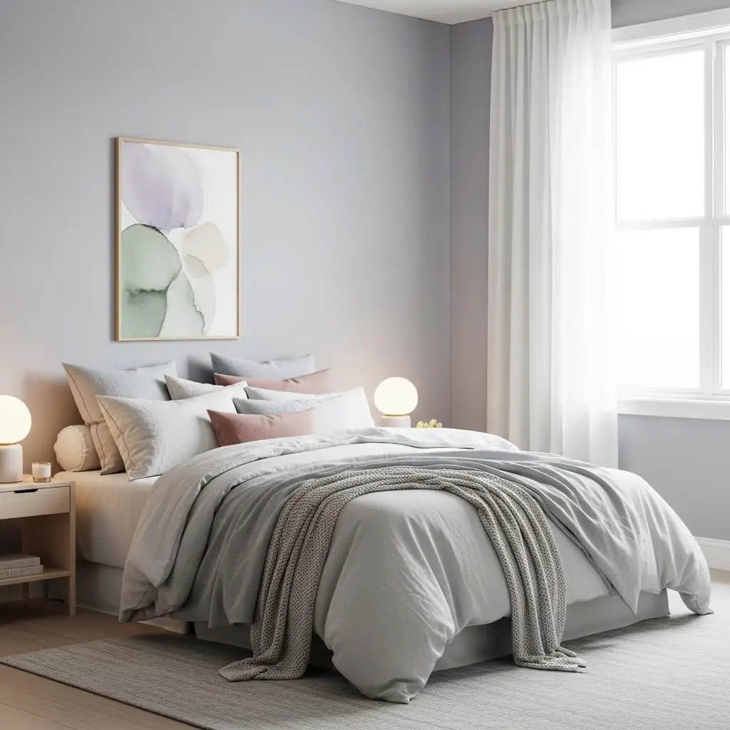
A bedroom should feel like a personal retreat where you can relax and unwind. Soft, muted shades can create a gentle atmosphere that feels peaceful at the end of the day.
Best colors: Lavender, sage, powder blue, and blush
Avoid: Bright yellow or red because stronger shades can feel too stimulating for a relaxing space.
Kitchen – Bright, Clean, and Happy
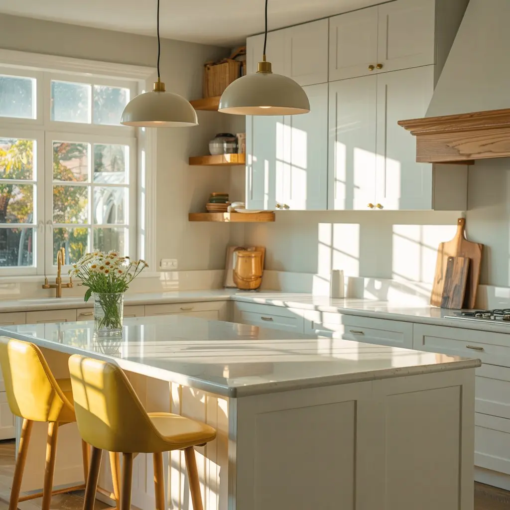
The kitchen benefits from colors that create energy and freshness without making the space feel chaotic. Light and muted tones can help maintain a clean and cheerful atmosphere.
Best colors: White, soft yellow, and muted blues
Avoid: Neon green, which can become visually overwhelming.
Bathroom – Spa-Like Calm
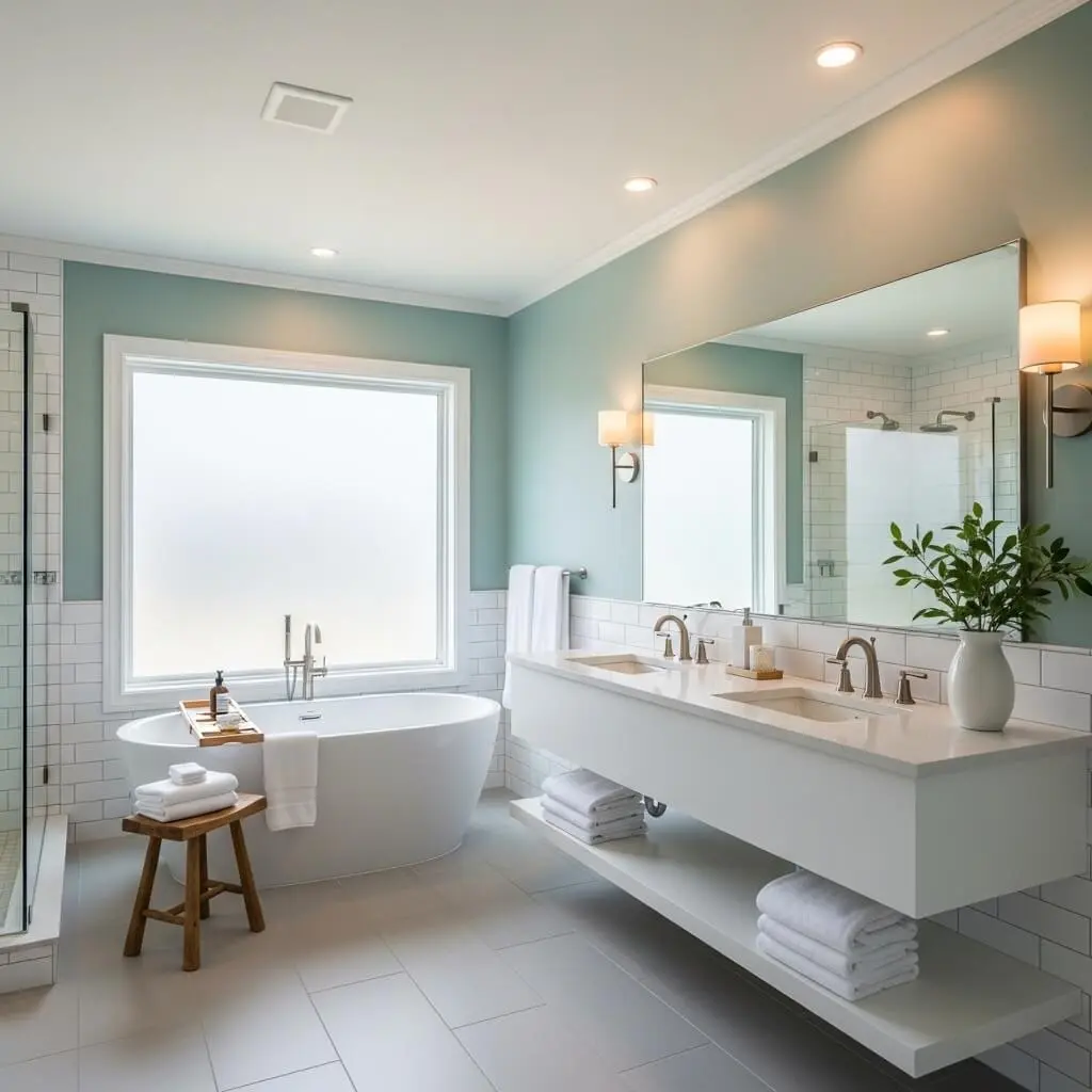
A bathroom can feel more relaxing when its color palette creates a spa-inspired atmosphere. Soft aquatic and neutral shades can make the space feel fresh, peaceful, and clean.
Best colors: Aqua, ivory, slate gray, and seafoam
Avoid: Very dark colors in small bathrooms, as they may make the space feel more enclosed.
Home Office – Focused, Motivated, Productive

A home office should encourage concentration while still feeling comfortable enough for extended periods of work. Deeper, muted shades can create a grounded atmosphere without becoming distracting.
Best colors: Navy, forest green, and gray-blue
Avoid: Extremely bright or distracting tones that may compete for attention.
Color Mistakes People Make (and How to Avoid Them)
Choosing colors based only on how they look in a store or online can lead to disappointing results. Factors such as lighting, undertones, room size, and neighboring colors can significantly change the final appearance. Avoiding a few common mistakes can help you create a palette that feels cohesive and intentional.
Ignoring undertones
Warm and cool undertones can dramatically affect how colors work together. A shade that looks perfect on its own may clash with other colors if its undertone is not compatible with the rest of the palette.
Choosing paint in-store
Paint can look completely different under store lighting than it does inside your home. Always test samples in the actual space before committing to a color.
Going too bold too fast
Strong colors can add personality, but using too much of a bold shade can overwhelm a room. Start by introducing dramatic colors through accessories and accents before covering an entire wall.
Forgetting room-to-room flow
Each room does not have to use exactly the same colors, but the overall palette should feel connected. Coordinating colors between spaces can help your home feel like one continuous story.
Not testing samples vertically
Paint can appear different when viewed on a wall compared with a flat board or ceiling. Testing samples vertically gives you a more realistic idea of how the color will look in the actual room.
Trending Color Palettes You’ll Love
A thoughtfully chosen color combination can immediately influence the personality of a room. These palette ideas combine complementary shades to create distinctive decorating styles while maintaining balance and visual harmony.
Earthy Minimalism
Sage, beige, clay, and white create a warm and grounded palette. This combination works especially well for interiors that aim for a natural, cozy, and uncluttered appearance.
Moody Luxe
Charcoal, deep plum, and gold create a dramatic and sophisticated atmosphere. This palette is ideal when you want a room to feel luxurious, rich, and slightly mysterious.
Soft Scandinavian
Cream, oat, soft gray, and muted blue create an airy and calming combination. These shades work beautifully with simple furniture, natural textures, and uncluttered spaces.
Modern Coastal
Navy, white, sand, and eucalyptus green create a crisp and refreshing coastal-inspired palette. The combination can bring a relaxed seaside feeling into a modern home.
Final Tips to Master Color Psychology Like a Designer
Mastering color psychology is about more than choosing attractive shades. Think about how you want each room to feel, then build your palette around that emotional goal. Use textures, natural materials, and carefully selected accents to add depth while keeping the overall combination balanced.
- Always consider how you want the room to feel
- Layer textures to create depth
- Use samples before making final decisions
- Add natural elements such as wood, plants, and brushed metals
- Balance warm and cool tones for harmony
The perfect palette does not need to follow every trend. It should reflect the atmosphere, lifestyle, and personality you want your home to express.
Conclusion — Your Home, Your Story
Choosing colors for your home is not simply about following the latest decorating trends. It is about creating an environment that reflects your personality, supports your lifestyle, and gives each room the right emotional atmosphere. By understanding color psychology, considering natural lighting, choosing a dominant shade, and adding secondary and accent colors thoughtfully, you can create spaces that look beautiful and feel right. Your ideal color palette does not have to be perfect—it simply needs to feel like home.