Every color has its own personality. Some soft neutrals quietly blend into the background, while others bring an earthy warmth that makes a room feel instantly comforting.
When it comes to the bedroom, the right color can do more than make the space look beautiful—it can also help create a calmer, more restful atmosphere. From soft greens to muted blues and warm neutrals, these soothing shades can transform your bedroom into a place where you can truly unwind.
Let’s take a closer look at some of the most peaceful bedroom colors and find the one that feels right for your space.

The Science Behind Peaceful Bedroom Colors and Better Sleep
The relationship between bedroom color and sleep goes beyond appearance. The colors surrounding you can influence the mood and atmosphere of your space, which may affect how easily you relax at the end of the day.
Soft, muted shades tend to create a calmer environment, while bright and highly stimulating colors can make a room feel more energetic. Cool tones, warm neutrals, and gentle earthy shades are often associated with relaxation and comfort.
Color also changes the way a bedroom feels visually. Softer hues are easier on the eyes, while warm or muted tones can create a sense of coziness. Choosing a peaceful color palette can help make your bedroom feel more like a retreat from the outside world.
1. Soft Sage Green: Nature’s Most Soothing Hue

Sage green has a naturally calming quality that makes it a beautiful choice for a peaceful bedroom. With its soft blend of green and gray, this earthy shade feels fresh, grounded, and easy to live with.
It brings a subtle connection to nature without being overly bright or bold. The muted undertones also give sage green a modern, sophisticated feel that works with a variety of decorating styles.
Why Sage Green Feels So Serene
Soft green tones often create a sense of balance and calm. Sage green, in particular, feels gentle and grounding, making it well suited to a bedroom where relaxation is the goal.
Its gray undertones prevent it from feeling too vibrant, while its natural green base adds warmth and freshness to the space.
Best Colors to Pair with Sage Green
Sage green works beautifully with warm, natural tones, including:
- Creamy white
- Soft beige
- Warm gray
- Natural wood finishes
For a little more contrast, consider adding dusty rose, soft coral, or warm cream accents. These shades complement sage without disrupting the room’s peaceful atmosphere.
Styling Tips for Sage Green Walls
If you are unsure about painting the entire room, start with a sage green accent wall behind the bed. For a softer, more cohesive look, pair sage walls with cream or warm white trim.
Natural textures also work especially well with this shade. Linen bedding, wool throws, woven rugs, and wooden furniture can add warmth and depth while maintaining the calm feeling.
2. Muted Lavender: The Perfect Balance of Calm and Romance
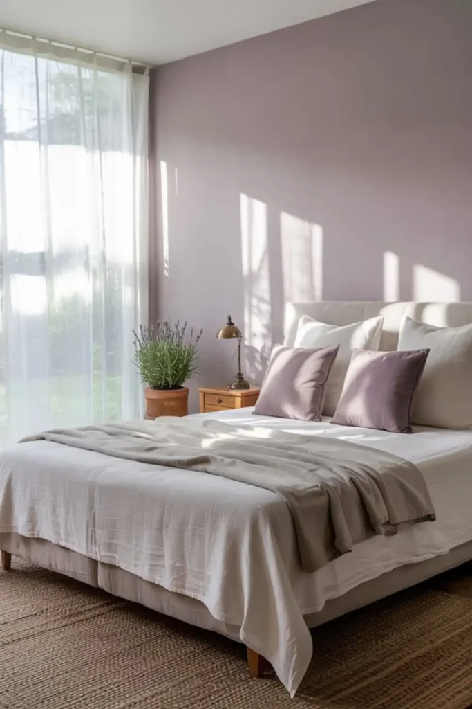
Muted lavender is a soft, elegant choice that brings both calm and a touch of romance to the bedroom. Unlike brighter shades of purple, muted lavender feels gentle and understated.
Its subtle tone creates a relaxing atmosphere while still adding personality and warmth to the space.
The Relaxing Appeal of Lavender Tones
Lavender has a naturally soft and soothing appearance. The muted version works especially well in bedrooms because it adds color without overwhelming the room.
This gentle shade can help create an environment that feels peaceful, balanced, and inviting—perfect for winding down at the end of the day.
How to Use Muted Lavender
Balance is key when decorating with lavender. Consider using it in smaller ways, such as:
- Painting one feature wall
- Choosing lavender bedding
- Adding lavender curtains or throw pillows
- Incorporating artwork with soft purple tones
Colors That Complement Lavender
Muted lavender pairs beautifully with:
- Soft dove gray
- Warm white
- Gentle sage green
- Cream and ivory
- Muted gold accents
These combinations can create a bedroom that feels peaceful, romantic, and beautifully balanced.
3. Warm Greige: The Ultimate Cozy Neutral

Warm greige is a versatile blend of gray and beige that gives a bedroom a cozy yet sophisticated feel. It offers the calmness of gray with the warmth of beige, creating a neutral that feels modern without being cold.
It is an excellent choice for anyone who wants a timeless bedroom color that works with both contemporary and classic interiors.
Creating Sophistication with Greige
Greige creates a calm, distraction-free backdrop that can make a bedroom feel like a relaxing retreat. It works beautifully on walls and can be layered with lighter and darker variations to create subtle depth.
For example, you might use a deeper greige on the walls and a lighter variation on the trim or ceiling.
Texture and Lighting Considerations
Greige works well with different textures and finishes. Matte walls can create a soft, cozy appearance, while satin or eggshell finishes add a subtle touch of refinement.
The direction of natural light also matters. North-facing bedrooms may benefit from warmer greige tones, while south-facing rooms can often handle cooler variations.
Layering natural materials such as linen, wool, and wood can make a greige bedroom feel even warmer and more inviting.
4. Pale Blue: Channeling Sky and Water for Tranquility
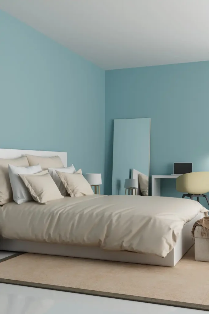
Pale blue has a peaceful, airy quality that can make a bedroom feel calm and refreshing. Inspired by clear skies and still water, this soft shade creates a sense of openness without feeling cold.
Its quiet, understated appearance makes it a popular choice for anyone looking to create a restful bedroom.
Why Pale Blue Feels So Calming
Soft blue tones are often associated with tranquility and relaxation. Their cool, gentle appearance can help create a space that feels quiet and settled.
Pale blue works particularly well in bedrooms with plenty of natural light, but warmer accents can also help keep the space from feeling too cool.
Different Shades of Pale Blue to Consider
- Powder blue for a soft and delicate look
- Sky blue for a brighter feel
- Periwinkle for a hint of warmth
- Ice blue for a crisp appearance
- Robin’s egg blue for a fresh touch
5. Dusty Rose: Warm and Nurturing Without Overwhelming
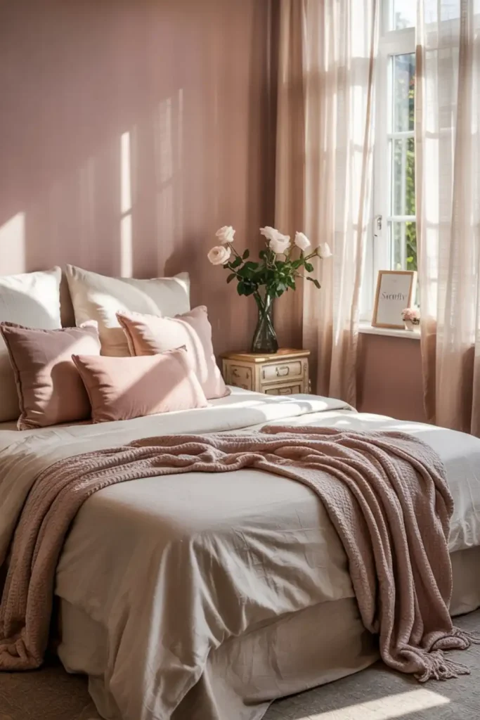
Dusty rose is a soft, muted pink that brings warmth and comfort to a bedroom. Unlike brighter pink shades, it feels subtle and sophisticated, making it easy to incorporate into a relaxing space.
Its warm undertones can make a room feel cozy and welcoming without becoming overly feminine or dramatic.
Complementary Colors and Decor
Dusty rose works beautifully with:
- Warm gray
- Soft white
- Muted sage green
- Cream and ivory
Natural textures can further enhance its cozy feel. Consider linen bedding, jute rugs, wooden furniture, and warm metal accents such as brass or copper.
6. Creamy Off-White: Minimalist Warmth That Opens Up a Space

Creamy off-white is perfect for creating a peaceful bedroom that feels bright, warm, and inviting. Unlike stark white, it has softer undertones that prevent the space from feeling cold or sterile.
It is especially useful in small bedrooms because it reflects light and can make the room feel more open.
Why Choose Warm White Over Stark White?
Warm off-white creates a softer and more welcoming atmosphere than pure white. It maintains the clean, minimalist appearance many homeowners love while adding a sense of comfort.
The subtle warmth can make a bedroom feel more relaxed and cozy, especially in spaces with limited natural light.
Creating Depth with Off-White Variations
A layered approach can keep an off-white bedroom from looking flat. Consider combining shades such as:
- Ivory
- Cream
- Pearl
- Eggshell
Using different shades within the same undertone family creates depth while maintaining a cohesive look.
How to Keep an Off-White Bedroom Interesting
Texture is essential in a neutral bedroom. Add visual interest through:
- Linen bedding
- Wool throws
- Natural wood furniture
- Textured curtains
- Layered rugs
Lighting can also make a significant difference. A combination of ambient, task, and accent lighting can give an off-white room more warmth and dimension.
7. Charcoal Gray: Embracing Moody Minimalism
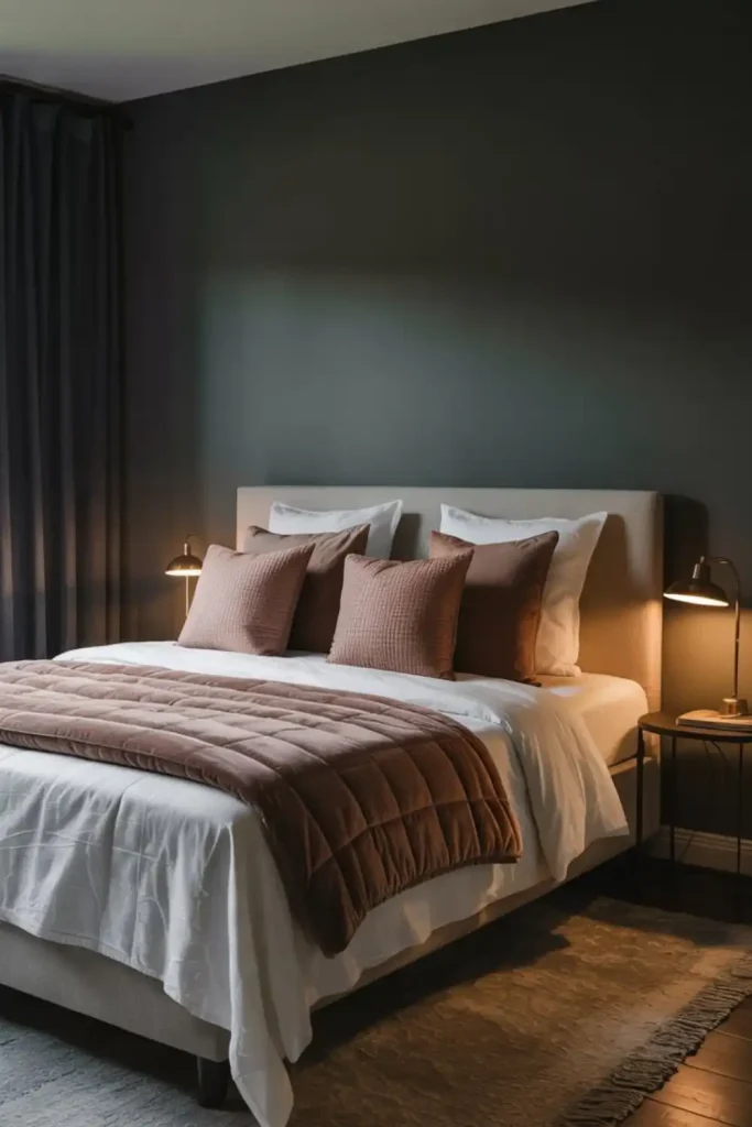
Charcoal gray may not be the first color that comes to mind when you think of a peaceful bedroom, but its deep, cocooning effect can create a wonderfully cozy retreat.
Rather than making the room feel heavy, the right shade of charcoal can add a sense of intimacy and comfort. It is especially effective for creating a moody, minimalist bedroom with a sophisticated atmosphere.
Why Charcoal Can Work in a Bedroom
Dark colors can create a sense of enclosure that makes a large room feel more intimate. Charcoal gray also provides a dramatic backdrop for lighter bedding, warm wood, and soft textiles.
To prevent the space from feeling too dark, balance charcoal walls with:
- Light or cream-colored bedding
- Warm wood furniture
- Soft textured fabrics
- Layered lighting
- Metallic accents
Final Thoughts
The best bedroom color is one that makes you feel comfortable and relaxed. Whether you prefer the natural softness of sage green, the elegance of muted lavender, the warmth of dusty rose, or the cozy depth of charcoal gray, each shade can help create a more peaceful space.
The key is to choose a color that works with your lighting, furniture, and personal style. Once you find the right shade, add texture, natural materials, and layered lighting to create a bedroom that feels calm, comfortable, and completely your own.